As everyone who’s been glancing now and then at my facebook page knows, I’ve been posting a lot of panoramas lately from the mysterious “Photosynth publish photos” app. Well, the app is now finally available on the iPhone— just look in the app store for “photosynth” or “bing” (Apple’s index looks like it’s rebuilding now, hopefully by the time I put this post up it’ll be fully live).
I’m very excited to finally have this app out there. The team’s done a wonderful job on it. Here’s the official blog post. They also shot a very nice release video, which to my chagrin ends with y.t. pontificating on a posthuman future.
A few notes on this evolution in the Photosynth and Bing Mobile story, in no particular order.
experience
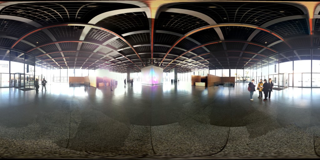
This app is a lot of fun to use, and the output is— I think— compelling. It addresses a fundamental limitation of cameras as we now know them: field of view. A phone’s camera is the right size and design for taking a snapshot of, say, someone’s face at a party. But as anyone who has tried to put up real estate photos knows well, trying to capture a view out the window with an ordinary camera is an awful experience. With your eyes, you see a whole forest; in the camera frame, you see a couple of trees. With Photosynth, you rotate the camera to take in the whole view, and the app fuses that view together:
 Of course there’s an inherent difficulty in taking these wide fields of view and projecting them down into planar images. It’s theoretically possible to do this with a perspective projection when the field of view is less than half a sphere, though in practice the image starts to distort unpleasantly when the larger axis exceeds 60 degrees or so. Remember that in our own eyes, the retina is hemispherical, not planar. Our very wide natural field of view doesn’t rely on a rectangular projection the way film or digital cameras do.
This is why, when Photosynth publishes photos to a flat medium, like the inline news feed in facebook or the flat image above, it uses a spherical projection, which results in a distorted image. Straight lines turn into arcs. This kind of imagery can be quite beautiful in its own right, though it can get a bit counterintuitive, especially as the field of view grows all the way to the full sphere.
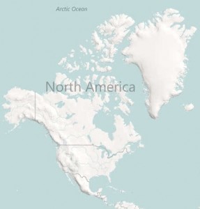
 Projecting the sphere down to a rectangular image is of course just what one does when one makes a flat map of the Earth. We’ve all seen planar world maps so often that we think of them as “normal”, while the above image looks “distorted”, although really they exhibit the same distortions.
  Yes, Greenland is big— about three times the size of Texas. Not twice the size of the whole USA.
The best way to experience a panorama is in an immersive viewer, which reprojects the imagery interactively into a smaller window, allowing you to rotate. We’re working on viewers that let these things happen in native Web-ese, though it requires advanced browsers (HTML5, Canvas or CSS3). In the meantime, it can be done with Silverlight. Here’s the panorama of the Neue Nationalgalerie above, rendered this way:
technology
In the past few years there has been a growing trickle of “smart” cameras and phone apps for stitching together photos or video into panoramas. Many of them aren’t particularly good, but I do need to give a shout out to our friends at Occipital, whose 360 panorama app was an inspiration to the team.
As far as I know, ours is the first app that goes beyond “strip” panorama making to allow coverage of the entire visual sphere with realtime tracking. This relies on some pretty cutting-edge computer vision hacking (thank you Georg). Extracting features from the video stream on the fly, following them from frame to frame, and modeling the environment in realtime is hardcore stuff, and requires not only high-performance algorithms, but also very aggressive low-level optimization and trickery with the camera and graphics pipelines. Fusion on the sphere isn’t all the way to full 3D modeling, but it already involves its share of topological complications and tradeoffs between local and global reconstruction. By all means, dear CS grads, try this at home (and send us your screenshots)— but be forewarned, there’s a reason why we haven’t seen a mobile app like this before in the market! This is a bit like Doom first appearing on the PC in 1993. Now that it’s been shown to be possible, we should expect quite a few followers, and a rapid evolution in realtime computer vision on mobile devices.
design
There’s another reason I’m very pleased by Photosynth for iPhone: it’s the first reasonably complete application of our design system to a non-Windows phone. We’ve been working for more than a year with the very beautiful design language created by the Entertainment and Devices people at Microsoft (yes, Microsoft can do beautiful design! It’s true!) for Xbox, Zune, and Windows Phone 7, codenamed Metro. The “lavender” map style we released last year is a cartographic embodiment of this language. Translating Metro for an environment like iPhone, in which there’s a strong native look, feel and interaction model, is risky business. Done poorly, the result is confusing and incongruous. Some would argue that an app should always adopt native controls, look and feel, tailoring itself entirely to the host platform to minimize cognitive dissonance. This is an old argument. I remember it from the X windows days, and earlier. (More recently, Apple’s first release of Safari on the PC garnered much criticism for its dissonant non-PC look and feel. Today they’ve moved closer to native.)
I think from this perspective the Photosynth app is a great success. Its interaction model, look and feel are very Metro, distinctively ours, yet it works in the iPhone context. It has a distinct voice, yet remains transparent and usable. It isn’t antisocial in its approach to the platform. I was delighted to read this post Adrienne found on Gizmodo (uncharacteristic reading material for her)—
Also, Microsoft, who as you may know makes their own mobile phone OS these days, has puckishly brought the Windows Phone 7 aesthetic to the iPhone app, which, man, is just really really nice. You don’t realise how, I don’t know, corny all these bevelled buttons and 3D animations are until you see Microsoft’s flat, geometric UI on your iPhone’s display... More apps that look like this, please.
One of the things that I think makes this easier to do on mobile devices than on PCs with windowing systems is the fact that mobile apps are always full-screen. They can create self-contained worlds by bookending an experience in time. This works for Web pages too, because the Web has evolved from the world of “content” instead of “application”— one wouldn’t complain about distinctive design language on a website, any more than one would complain about inconsistent fonts on the covers of different magazines lined up on a rack. Fortunately, between websites and mobile apps, we have the next decade pretty much covered.
Here’s one of my favorite screens from the Photosynth app:
 The typography is beautiful and clean, the visual balance reminiscent of mid-20th century Swiss design. Surfaces are flat, corners square, and any content shown is authentic, not just representative. That unstitched pano is a lovely artifact in its own right, a bit of a nod to David Hockney’s joiners. I hope that with this app we prove that we can have our cake and eat it too— usability, beauty, a distinctive voice.
bloopers
There are a couple of simple rules to follow in order to make a great panorama. The first is to rotate the phone in place instead of holding it out at arm’s length and sweeping it. This is especially important in indoor environments, where many surfaces are nearby and any movement of the focal point will result in images with differing perspectives— which are much harder to stitch. Admittedly it’s a bit awkward to do this. In practice it means doing a little dance around the phone— you orbit around it while it stays in place. It helps to identify a landmark on the ground and make sure the phone stays right over it. If you want to do a full sphere, you’ll also have to point the phone down at the ground at some point, and if you don’t want your disembodied feet in there, you’ll have to back away from the phone and point it down carefully to avoid them. You’ll look silly, but the beautiful immersive pano will be worth it, right?
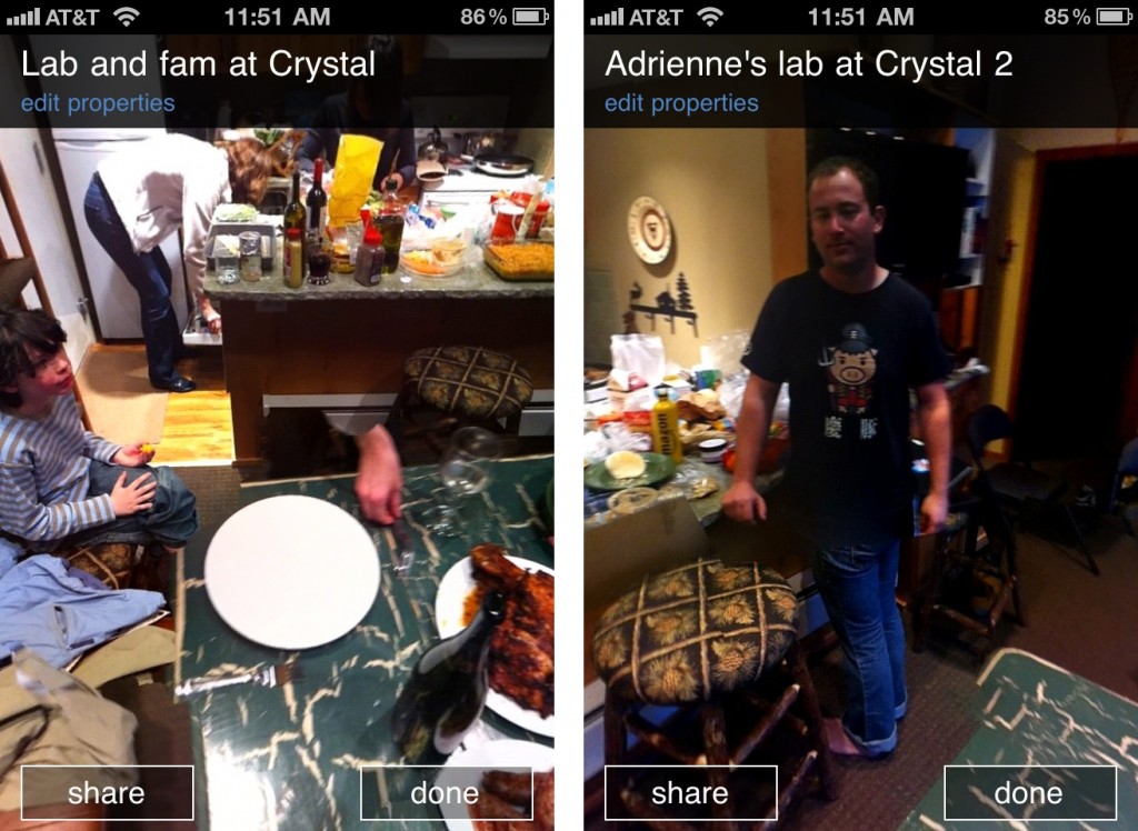
The other rule is that when there are people in your pano, you want to try to get them to stay very still while you’re shooting near them, or manage your capture in such a way that they only appear in a single photo. Otherwise, between the graph cut algorithm and the Helmholtz blending, you’ll splinch your friends:
 (The pano on the right is especially interesting. Mike is wearing Heather’s legs.)
One final tip. If you can, turn on “exposure lock” in the settings screen. This will help the blending. With exposure lock off, the algorithms must do their best to blend shots taken with very different exposure settings and color balances, which will sometimes leave artifacts in spite of our best efforts. It’s not always possible to lock exposure, because in some panoramas you’ll be shooting both straight at the sun and into deep shadow.
what about windows phone 7?
I’m sure over the coming days and weeks we’ll be answering, over and over, the “why didn’t this ship first on Microsoft’s own phone” question. Our approach to the design of the Photosynth app hopefully provides some evidence that we very much think of Windows Phone 7 as brethren and inspiration, not to mention proof that Microsoft can make beautiful things. (Such a joy and a relief, after the previous generation of Windows phones!) If we could have shipped first on these devices, we would have. But the level of camera and low-level algorithmic hacking needed to make Photosynth work meant that, if we wanted to get this out as quickly as possible— and we surely did— we needed to do so on a platform that provided the necessary low-level device access. Windows Phone 7 doesn’t yet allow this for apps. It will soon. It’s worth keeping in mind that the first several generations of iPhone device and OS wouldn’t have allowed us to build this app either. For now, iPhone’s platform maturity— and of course the large number of people with iPhones out there— meant that it made sense for us to go for it.
At Bing we’re always interested in reaching as many people as possible, which means we’ll always develop for multiple platforms. But over time, we’ll be doing more and more of our early innovation on the Windows Phone.
future
We hope that in addition to being a good party trick, the Photosynth app will have lots of people recording places and events they want to remember and share with friends. And share with the world. A major element in the larger vision of Photosynth is to let many different types of media connect together into a kind of shared “world tapestry”. I’ll be talking about this, sharing both our thinking and some of our latest work, at Where 2.0 on Wednesday. That might require another post. It’s exciting, in any event, to be furthering this story again, after a year spent mostly on incubating other aspects of Bing Mobile.

Pingback: Photosynth for WP7 « Go Microsoft !!!!!!!
Pingback: My Microsoft Life » Photosynth: coming next to Windows Phone [Update]
Pingback: Photosynth team explain their iPhone first decision: “ we needed … low-level device access”
Pingback: Microsoft explains lack of Windows Phone 7 Photosynth app, promises one in future | WinRumors
Pingback: Microsoft Photosynth promesso per il WP7 in un prossimo futuro | Windows Phone Magazine Italia il blog Italiano sul Microsoft Windows Phone 7
Pingback: Don’t worry, Windows Phone will get the Photosynth app too, eventually
Pingback: Sites Thursday, 21 April 2011-Bing Read / Write World-Photosynth app-iPhone tracker map-Switch to Hotmail-Shift 2 Unleased tips and DLC « webDotWiz talks Windows Live
Pingback: Windows Phone Dev Podcast » Episode 013 – “Ahead of Schedule”
Pingback: Photosynth goes mobile » learn | you | good - we're chained to the world and we've all gotta pull…
Pingback: Quora